This precious girl graduated from high school in May.
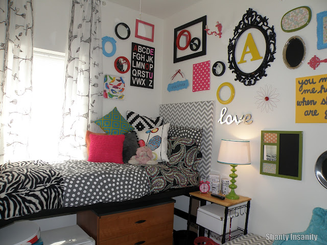
The gallery wall was inspired by Pinterest, and I began collecting thrift store items to use back in the spring. We threw in a few other pieces, such as canvases, a great centerpiece frame from IKEA and several other clearance sale items to pull it all together. I used several bright colors of spray paint to bring new life to the old thrift store items. The repetition of these colors, along with the anchor color, black, made this wall a show stopper! {And the high ceilings didn't hurt at all either.} The curtains came from IKEA also. We decided to hang them all the way up to the ceiling, and it really does help draw the eye upward....along with the gallery wall. Since she is on the top floor, the ceilings are 3 feet higher than the lower floors.....worked out great to make this small space look larger!
One of the favorites for this room turned out to be this bench. I found this at the thrift store and bargained to bring the price down to $15. I painted the piece a nice shade of pink, added IKEA boxes to the opening and made a padded cushion with gray chevron print on top. This is a comfy spot for visitors and the storage boxes add some great hiding places for a girl living in such a small space!
The rug is from IKEA. While we both loved it as soon as we saw it in the store, I really struggled with purchasing it because it was a bit more than I wanted to spend. The rug really anchors the space and adds more visual depth. So glad we decided to get it....$80 well spent! :o)
The bedding is a hodge-podge from IKEA, Target and Pottery Barn. We didn't want this room to look matchy-matchy. And we didn't want it to look like a little girl lived there. I think this combination of fabrics looks very "anthropology-ish" and very grown up. The bed is a twin XL and Pottery Barn teen has a great line of dorm linens that were perfect! Their sheet sets are a bit more than some other stores, but they fit perfectly and the paisley pattern worked perfectly in our big scheme for the room. The polka dot duvet cover is from IKEA and it was not my choice. My college girl fell in love with it, and there was no talking her out of it. We were worried because IKEA bed linens are not made for twin XL beds, but it worked just fine. I am very happy that she insisted on the gray and white polka dots....I really love it! The pillows are from Target and IKEA. We knew we wanted lots of bright colors and not matchy....the combination we ended up with really works well together! And Puffy right in the middle of it all....just melts my heart!
And the chevron pirnt headboard was her daddy's contribution to the room. :o) He used plywood and mdf that he had as scraps. I covered the plywood with quilt batting and the great gray/white chevron print. Daddy added some mdf legs and this headboard really gives her room a homey feel!
The other side of the room is not nearly as exciting, but oh so important! The desk area holds her computer & printer, her television and a very important new pet....Harry Potter, the beta fish!
And my college girl LOVES her new space! She is loving college life and I am happy for her that she gets this opportunity. Now....the true test.....can she keep it clean???
Linking up to a few great blogs:


